Ana Domínguez Siemens talks with Johanna Grawunder
Architect of Light
-

LB Collection light designed for a private home
© Thomas Mailaender; courtesy of Johanna Grawunder
-

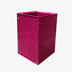
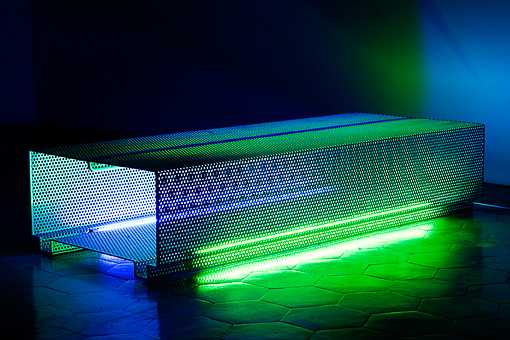
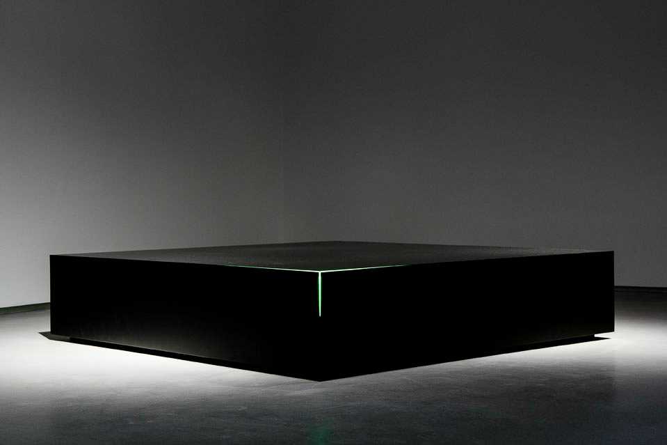
Perf bench
Courtesy of Galleria O
-

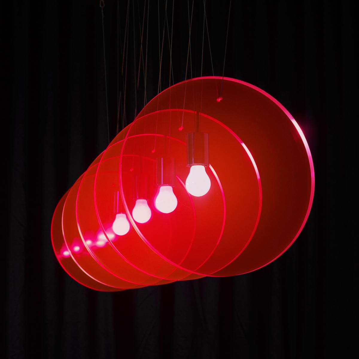
Davos Dilemma lights
Courtesy of Galleria O
-

Courtesy of Johanna Grawunder
-

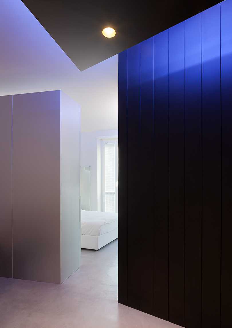
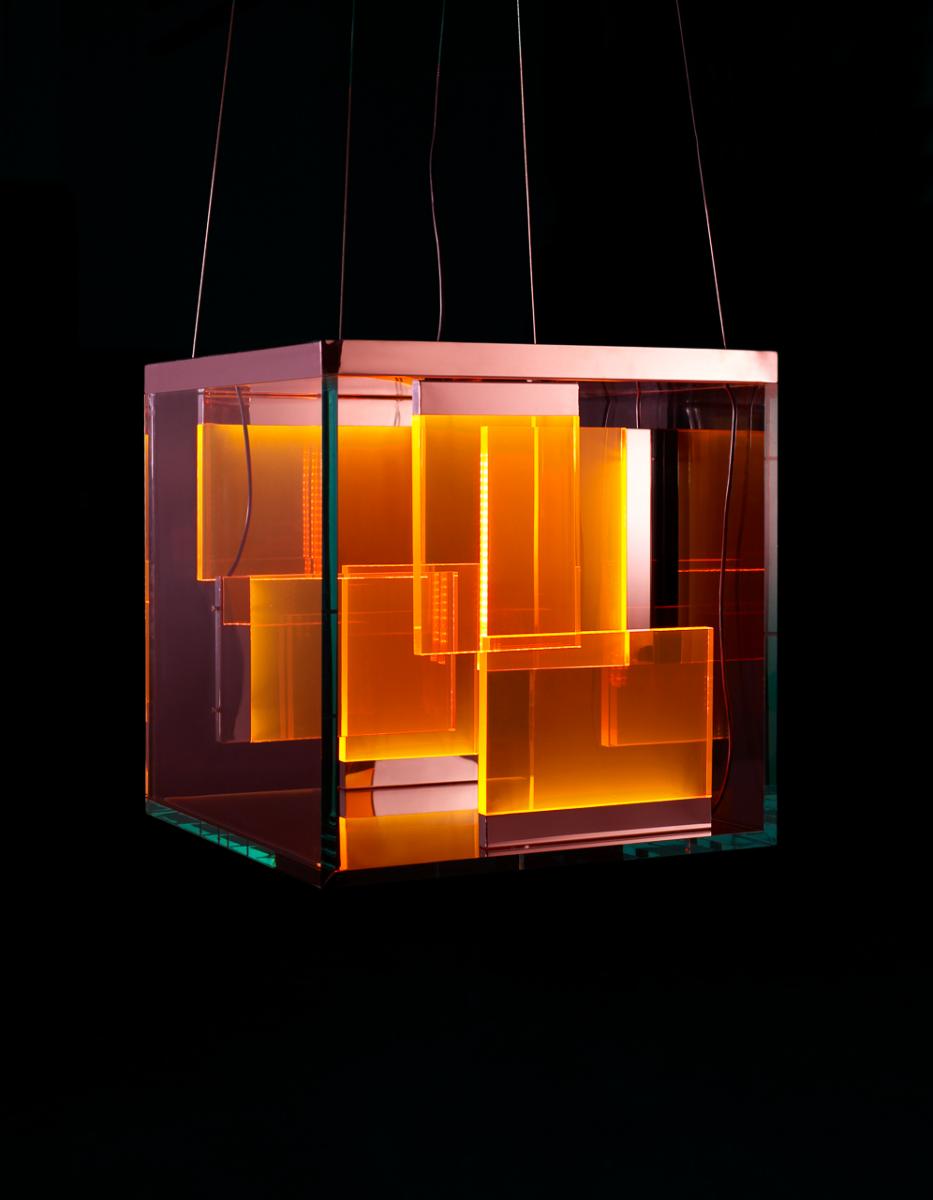
Boxy, collection of containers with integrated light for GlasItalia
Courtesy of Johanna Grawunder
-

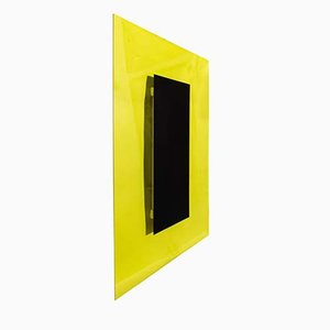
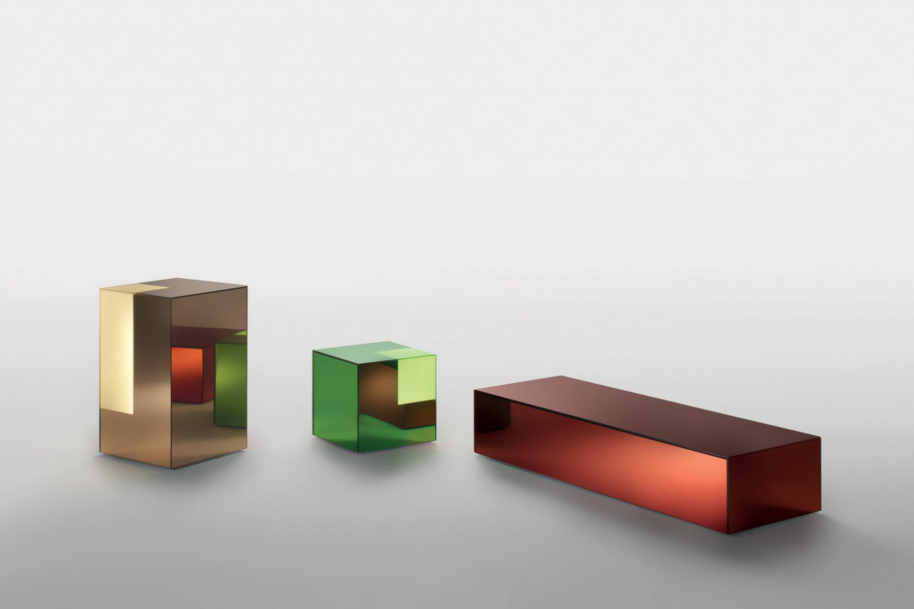
XX & xxx for GlasItalia
Courtesy of Johanna Grawunder
-

Arielle lamp
Courtesy of Johanna Grawunder
-

Big Sky floor light
Courtesy of Johanna Grawunder
-

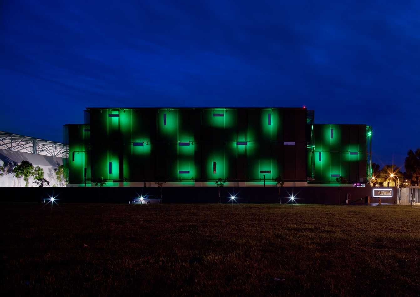
Freeport building, Singapore
Courtesy of Johanna Grawunder
-

Courtesy of Johanna Grawunder
-

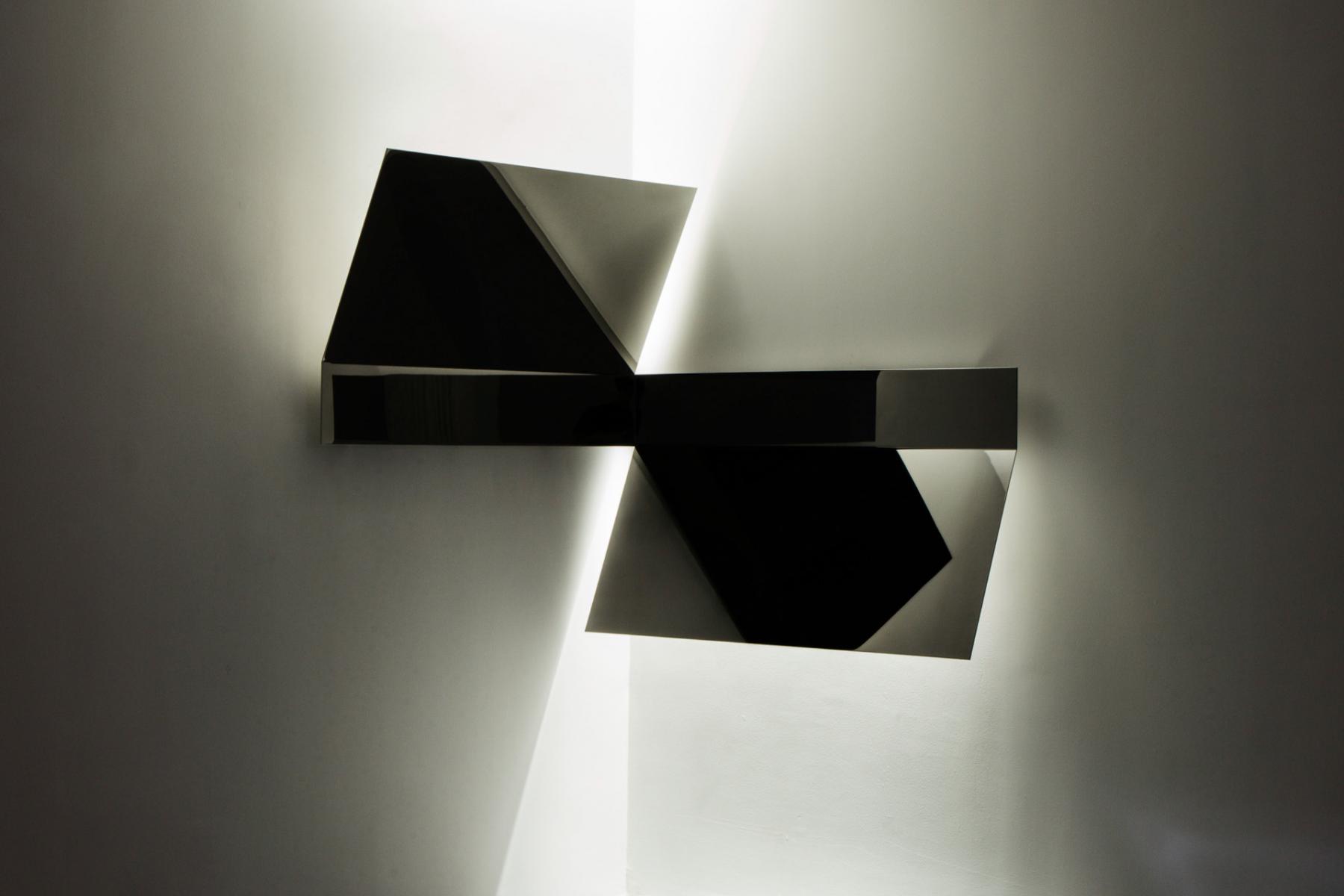
Gio Light, hommage to Gio Ponti
Courtesy of Johanna Grawunder
-

Big Sky wall light
Courtesy of Johanna Grawunder
-

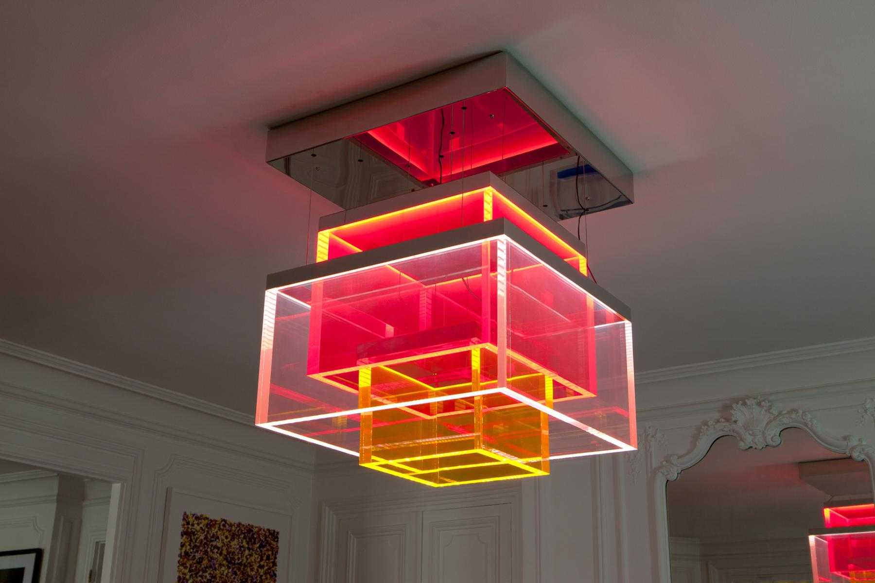
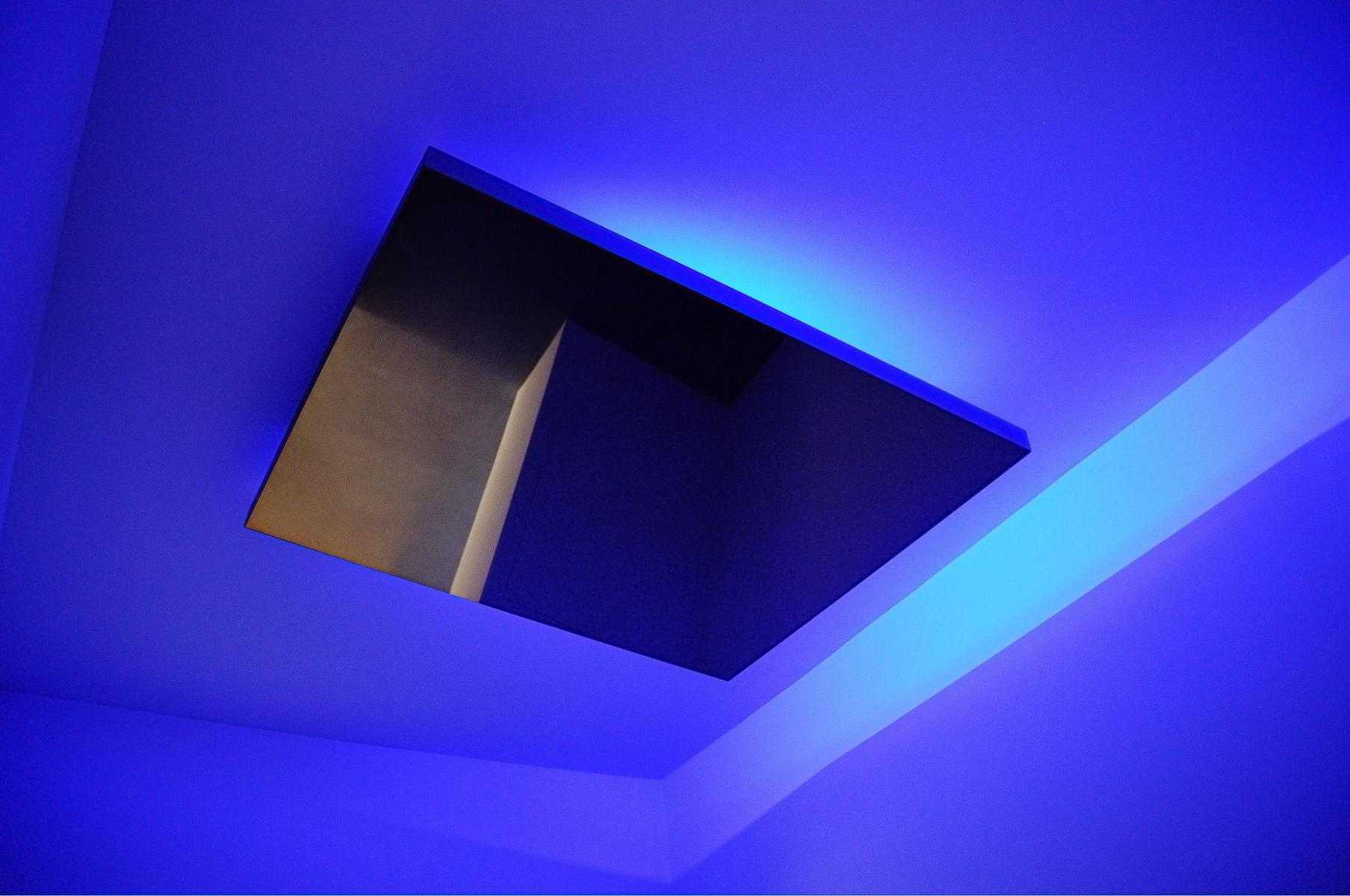
Big Sky ceiling light
Courtesy of Carpenters Workshop Gallery
-

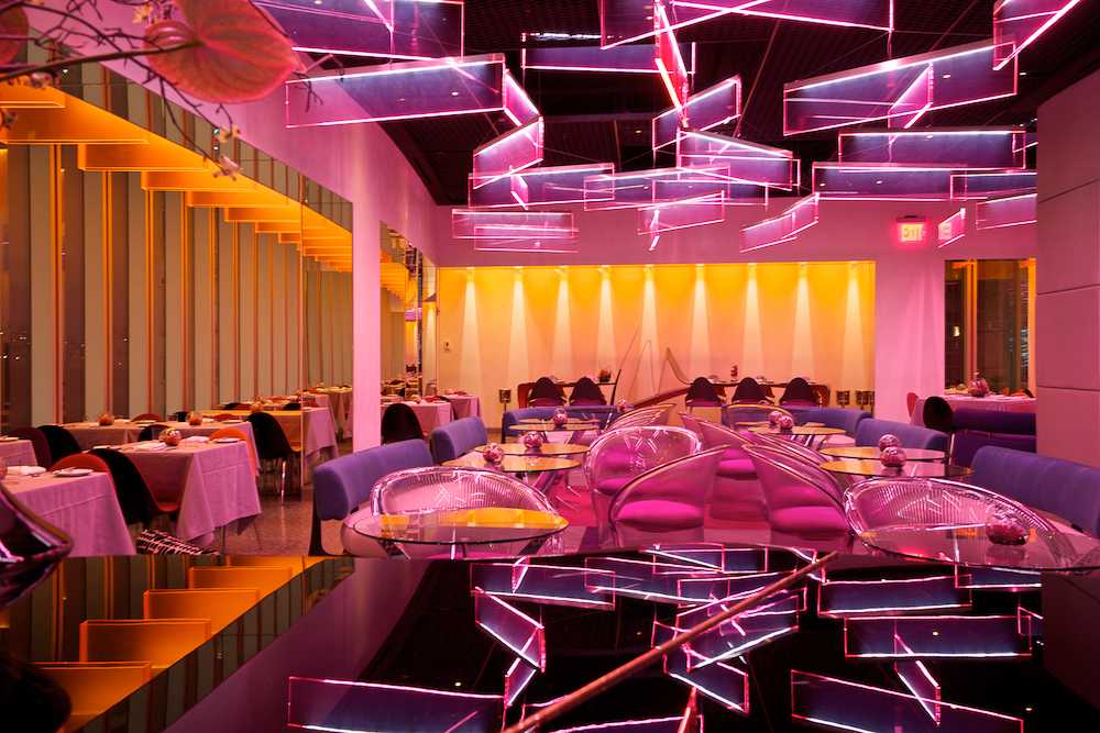
Robert restaurant, New York
© Robert Leslie; courtesy of Johanna Grawunder


Living and working between Milan and San Francisco, architect-designer Johanna Grawunder has created work across the spectrum of design, from complete interiors, site-specific commissions, and large-scale public projects, to limited-edition and mass-produced furniture. Her specialty, however, is light – glowing, sculptural installations and objects that enhance the architecture of their environments. Design writer Ana Domínguez Siemens interviews Grawunder about the inspirations and aspirations that drive her creative production.
Ana Domínguez Siemens: You have studios in San Francisco and in Milan, two completely different locations. Do you think that place matters? What kind of relationship do you have with each of these cities, and what do they mean to your work?
Johanna Grawunder: Place definitely affects the ambient vibe. Even though I can work from almost anywhere – due to the structure of my studio and the nature of my work – the people I’m around, the chance encounters I have, and my everyday routines are different in each place. I’m fed by San Francisco’s focus on technology and ecology and by Milan’s respect for design and the business of design. But in the end, my work is my work and I’m inspired everywhere I go.
ADS: Your projects represent such a wide range of scales, from architecture and interiors to products. How do you approach each project? Do you feel particularly comfortable working at a certain scale?
JG: I feel comfortable working at any scale (so far) and prefer to jump around a lot. The transposition of scale is an important aspect of my work; my object and product designs have an architectural and somewhat formal abstraction that stems from my training and practice as an architect. When I design a light or smaller object, it is not the size that matters so much as the “architecture” of the piece.
ADS: In terms of furniture and objects, is it more important for you to produce for industry or to create limited-edition or one-off projects? Which do you enjoy more?
JG: Most of my most recent work is custom one-offs and limited editions. Usually these pieces are made for private clients, public projects, or galleries (such as Carpenters Workshop). But I also work exclusively with Flos on industrially produced lights and have collaborated on other products with Italian brands such as Glas Italia and Boffi.
The cliché is that there is more freedom and creativity in the limited-edition and one-off processes, and this is true in my case to the extent that such pieces only have to be loved by between one and ten people in the world. In industry of course, you have to design for a greater audience, and that tends to flatten out the strength of a design: a lowest-common-denominator risk factor. But recently I have recanted on this idea. Regarding my own experience with, for example, Glas Italia, the industrial pieces I designed are as strong and idiosyncratic as my gallery work. And they are also successful products. I have been very lucky to work with great companies and great CEOs who are probably not the typical industrial client.
I think there is a great need for the pure research afforded by limited-edition and one-off design work, just as there is a great need for good architecture. They are both in the realm of “prototypes,” so always about trying new things, exploring new materials and processes, and attempting some sort of cultural resonance in the greater contemporary landscape. Likewise, the importance of widely available, well-designed industrial products – whether “design-y” and idiosyncratic or aesthetically “perfect” (like an iPhone) – is incontestable now. Savvy consumers, like savvy collectors, will no longer accept compromises.
 Johanna Grawunder
© Lutz Sternstein / Courtesy of Johanna Grawunder
Johanna Grawunder
© Lutz Sternstein / Courtesy of Johanna Grawunder
ADS: Technology and craftsmanship seem to be equally crucial to your work. Is one more important than the other? How do you balance the relationship between them?
JG: Technology and craftsmanship are both very important in my work but not as a means to an end. I am not necessarily interested in being the first person to use a new technology or to position technology as the primary driver of a design, because that basically creates an obsolescence time-bomb. When design is too technology-driven and the technologies become ubiquitous (as they all eventually do), then you’re stuck with a gadget. I prefer to use the most advanced, correct technology I can find in order to do the things I want to do. Not the other way around.
Craftsmanship is slightly different because a beautifully crafted design, regardless of temporal function or form, will always have the inherent quality of refinement or perfection that defines “craftsmanship”. A beautifully made antique radio still has value, even if it’s a mostly sculptural value.
But since I am a designer, craftsmanship alone isn’t enough. It is important for me to create lights that make beautiful light and create furniture or interiors that define spaces and solve problems. Yes, things are better when they are beautifully made, and the producers we use are the best in the world, but I’m not OCD about it.
ADS: Light seems to be your preferred design typology. You even incorporate it into your furniture. Can you discuss this aspect of your work?
JG: I think of light as another material, a sort of magical one. I use it in the same way I use texture or color or form – as an integral part of a design. And I tend to incorporate light into most of my furniture, interiors, and installations because it is part of my vocabulary and my color palette. Through architecture, you learn to define spaces with natural light, and most of my architectural work tries to define spaces with artificial light as well. So integrating light into architecture and eventually into tables, interiors, and, of course, actual lights was a natural progression.
Light colors, even white light, are different than paint colors or natural material colors. There is more vibration and essence and, to me, more soul in luminous, electrified colors. I do not think all things should have, or need, light-color, but sometimes it is an efficient and “living” enhancement.
ADS: There is a strong connection between your work and that of some artists who have worked with light in the past. Have these artists influenced your practice?
JG: Of course, I am a fan of Dan Flavin, James Turrell, Larry Bell, and others. They invented Light Art and have shown us the unlimited nature of using light as a primary material. I can spend hours in front of any piece by any one of them, and I admit I get the most personal enjoyment from this kind of work. But my attraction to light comes more from earlier discoveries, like Las Vegas and Christmas. And Southern California billboards and freeways. In other words, many of the same original influences that inspired the Light Artists in the 50s and 60s set me up for a life in light as well. I am also a huge fan of Max Bill, JR, and Enzo Cucchi, but no one ever asks me about that!
ADS: Has the arrival of LED technology been an agent of evolution for you? Are there other technologies that have been important to the pieces you design?
JG: LED is an amazing technology that has allowed me, and inspired me, to make very linear and architecturally scaled pieces. Before LED, I was using fluorescent tubes to get a similar geometry. But they were hard to dim, and the light wasn’t so great. So LED, once I felt that it was actually ready for “prime-time,” has been very important to my work. Colored transparency, whether acrylic or glass, has also been an important “technology,” though it may seem strange to denote a quality as a technology.
I am looking forward to using OLED sometime soon. Right now, this technology remains quite expensive and the light requirements I’m after are not easily satisfied by OLED. But I’m sure this will change soon.
I am also very interested in high performance projection lights, such as LEP (Light Emitting Plasma), which I used in BOX, a recent chandelier for Carpenters Workshop Gallery. With this type of projecting light, we were able to sculpt the light into an efficient, precise geometric square, which we used to define the overall form of the chandelier.
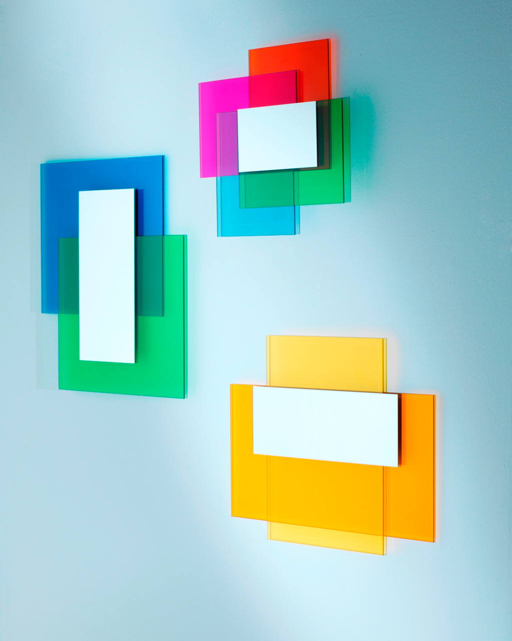 Colour on Colour, collection of mirrors for GlasItalia
Courtesy of Johanna Grawunder
Colour on Colour, collection of mirrors for GlasItalia
Courtesy of Johanna Grawunder
ADS: How do you approach color?
JG: Color is another material, like natural wood or light. But I associate colors with materials – such as green grass, or pink sunset – because color is totally meaningless unless attached to a material.
ADS: Is the mix of materials, like plastics and metals, also an important feature in your pieces? To what extent is the formal effect important to you?
JG: Mixing materials, for me, is pretty much a function of either structural integrity or functional necessity. I don’t like to stylistically or aesthetically mix materials for its own sake. I use different materials based on what is most appropriate, and I am happy to make pieces using only one material when the effect I am after is obtainable that way.
Acrylic, for example, conducts light beautifully through its entire thickness, so you get specific light effects that are not get-able from other materials. Bead-blasted anodized aluminum is another example of a material that gives reflective effects that are material-specific.
ADS: What is the best design advice you got from Ettore Sottsass, having worked with him for so many years?
JG: Sottsass was very encouraging. He emphasized the idea that there is never ONE correct solution to a design problem, but rather an infinity of possibilities (some better than others). The trick is to know your criteria and make design decisions based on that. I use this bit of wisdom daily. And I feel sorry for people who are trapped in the search for the perfect solution to anything, much less a lamp.
ADS: It seems you are preparing a new exhibition for Carpenters Workshop. Can you tell us about it?
JG: Thank you for asking! My new exhibition will open on June 24th in the London Gallery of Carpenters. It is a tight little show with four new pieces called: “No Whining on the Yacht”. Each piece is associated with a color. I wanted to experiment with color in a definitive way, asking myself what is a good color for a dining table (red); what is a good color for a chandelier (gold); a garden table (black with green light); and a floor light (pink). The pieces are studies in colored reflected light, very dim light effects (just enough to make the color glow), and refracted light effects with sculptural voids. I hope you will like the pieces.
The title comes from a saying I’ve been hearing around. I wanted to show an appreciation for the privileged world of art and design-art. Everything being relative, of course.
-
Interview by
-

Ana Domínguez Siemens
Ana is an award-winning, Madrid-based design writer and curator who regularly contributes both to exhibition catalogues and publications such as AD España, Vogue España, Diseño Interior, and DAMn°.
-