India Mahdavi speaks to Scott Indrisek about designing modern classics
India Anew
-

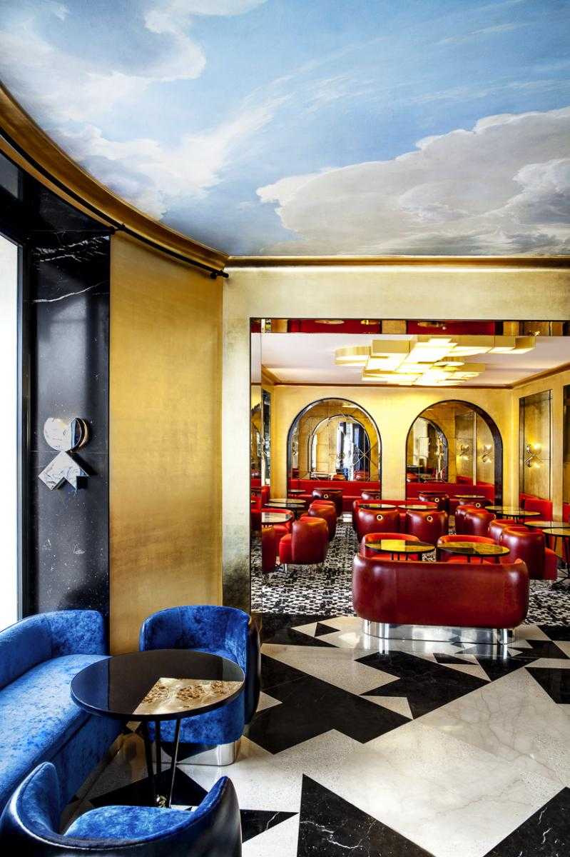
Bar Français by India Mahdavi
© Matthieu Salvaing; courtesy of India Mahdavi
-

Café Français by India Mahdavi
© Matthieu Salvaing; courtesy of India Mahdavi
-

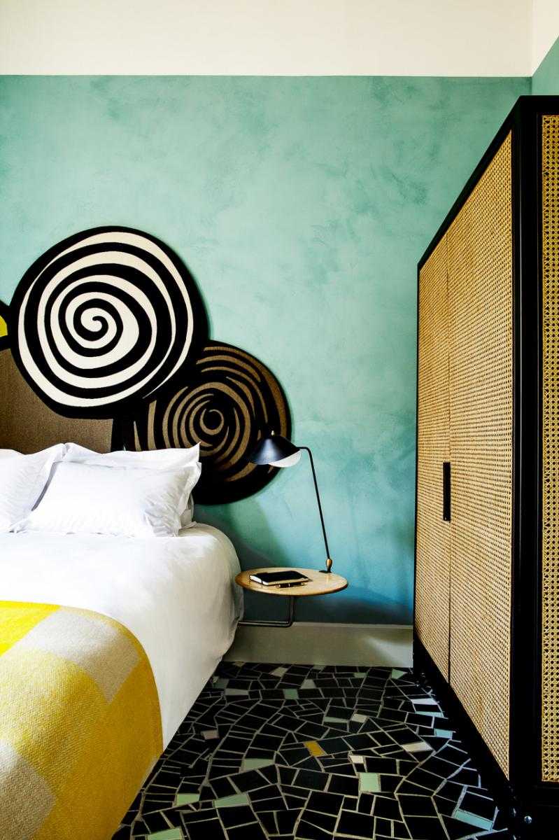
Hôtel du Cloître by India Mahdavi
© Matthieu Salvaing; courtesy of India Mahdavi
-

Café Germain by India Mahdavi
© Derek Hudson; courtesy of India Mahdavi
-

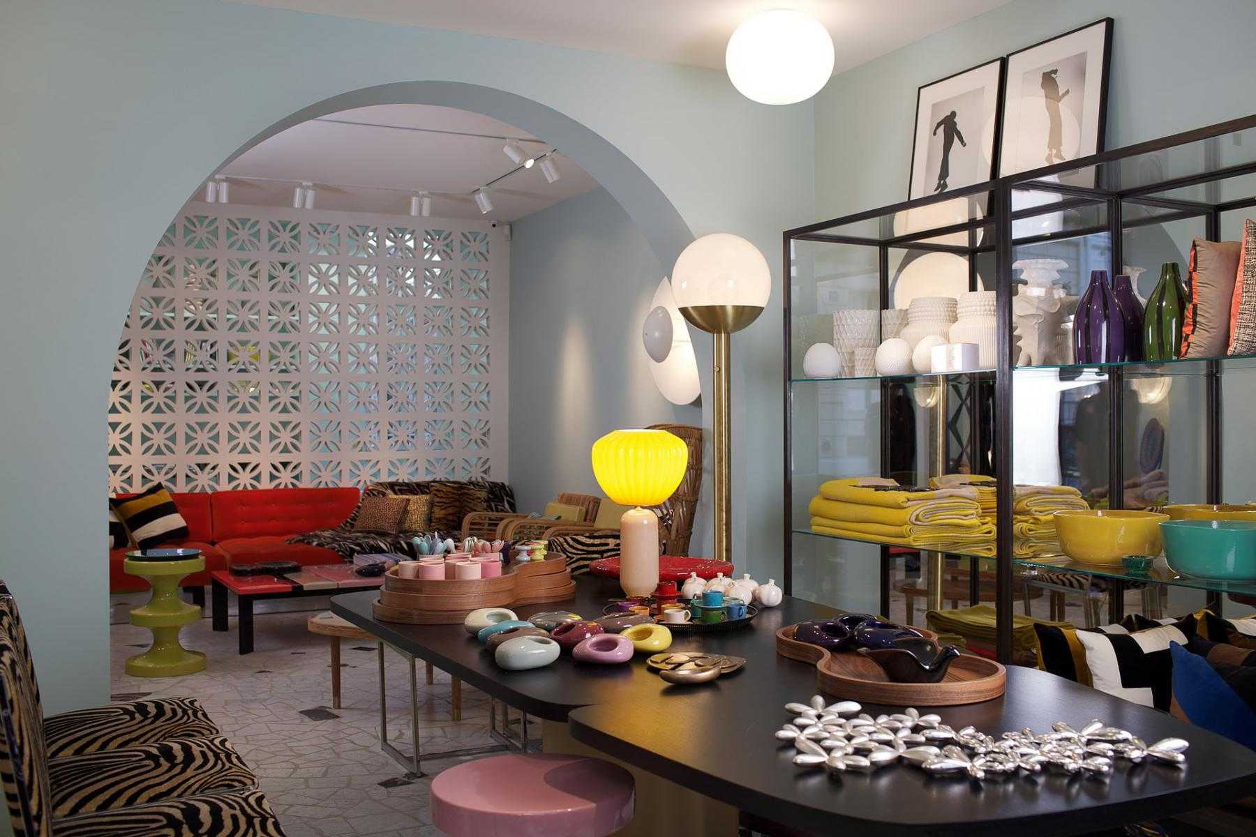
Accessories boutique #19 by India Mahdavi
© Thierry Depagne; courtesy of India Mahdavi
-

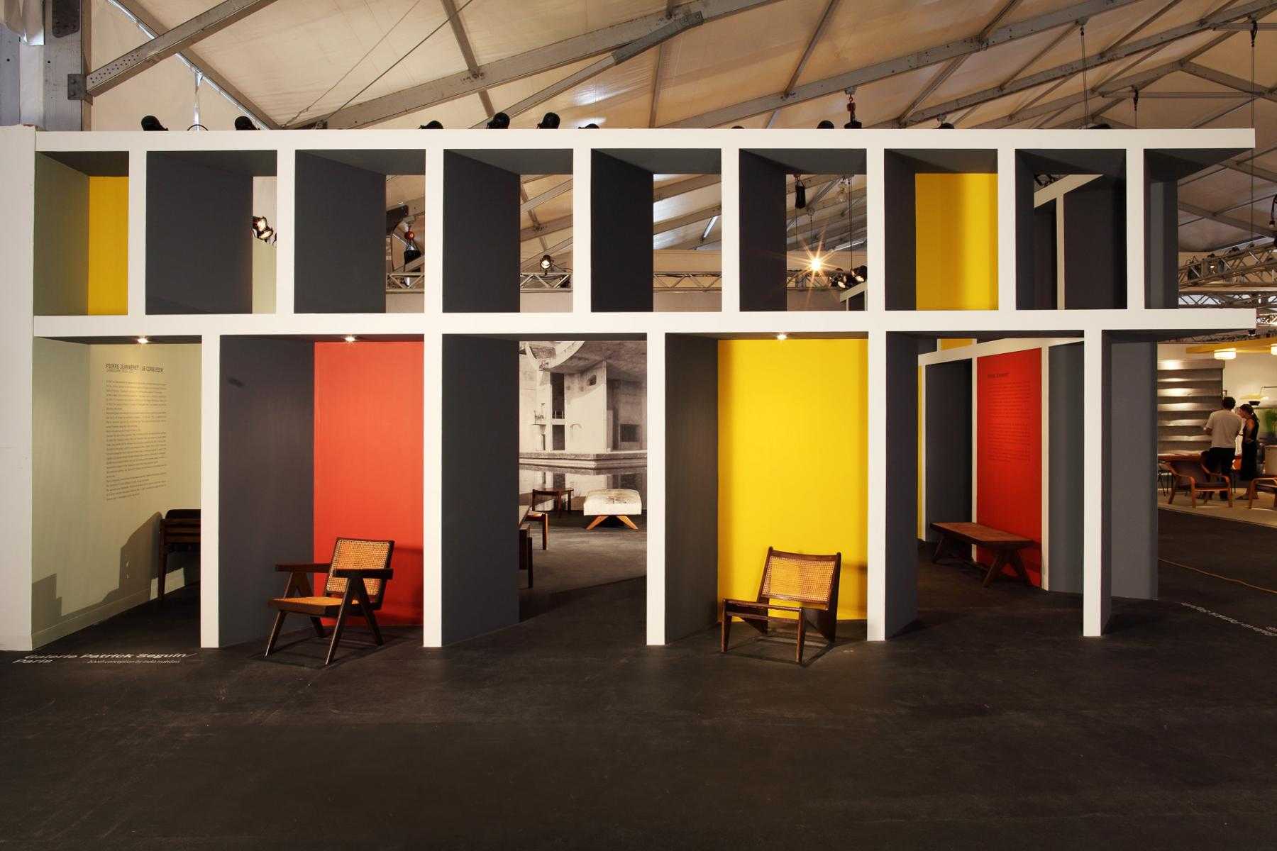
Scenography for Patrick Seguin by India Mahdavi
Courtesy of India Mahdavi
-

Scenography for Patrick Seguin by India Mahdavi
Courtesy of India Mahdavi
-

Bishop Stool by India Mahdavi
Courtesy of India Mahdavi
-

Voids collection by India Mahdavi for JEM
Courtesy of India Mahdavi


Multi-faceted Paris-based designer India Mahdavi has built an international reputation with her refined eye for materials and color. Never one to repeat herself, Mahdavi’s multifarious oeuvre includes unforgettable interiors, including the vibrant suites in the Hotel on Rivington and the lush environs of the Café Français in Paris, a collaboration with design duo M/M (Paris); furniture pieces, like her iconic, brightly-hued Bishop stool series; and striking exhibition designs for the likes of gallerist Patrick Seguin. We spoke with Mahdavi about her recent Landscapes series—a range of tables and vases that were commissioned by Beirut’s Carwan Gallery for the 2012 Design Miami fair, and also shown at the recent Design Parade in Hyères, France—as well as some of her most successful commissions, from Mexico City to Arles.
Scott Indrisek: When you approach a space—whether that’s a café commission or a private residence—what are the first steps that you take when thinking about how you will put your mark on it?
India Mahdavi: For me, designing a space is not about putting my mark on it; rather, it’s about understanding the client and the space itself. For instance, when it’s a private space, I consider my work closer to portraiture. I try to understand how my clients wish to live and how the space flows. It’s like a photographer’s perception; he doesn’t necessarily need to know his subject intimately, but he usually has an impression, an intuition, and then shoots his portrait.
SI: Are you more excited by private commissions or commercial projects?
IM: It’s all about the right balance. I really like dealing with different scales and different time frames. For commercial projects such as restaurants or hotels, I try to create spatial identities that are longer-term projects. My scenography and my design work (furniture and objects), on the other hand, allow me a much faster pace, changing scale the whole time to keep me alert. I try not to get bored.
 India Mahdavi
© Paolo Roversi
India Mahdavi
© Paolo Roversi
SI: One of your recent projects involved the design for the Café Français in Paris. Can you tell me a bit more about that space, which was designed in collaboration with M/M (Paris)? They contributed a graphic pattern that appears on the floor, among many other places.
IM: I had started defining a palette of materials and colors—marble, terrazzo—and, when M/M (Paris) suggested the introduction of the graphic elements, the famous bleu, blanc, et rouge. Their pattern, based on the Café Français logo, is everywhere in subtle ways, so you can’t necessarily read it. Basically it became a vocabulary, a grammar.
I thoroughly enjoyed this collaboration. It was really like a ping-pong game; you give and get constant feedback, which refines and enriches the project. M/M (Paris) have a much more masculine, radical way of thinking, while I tend to focus more on spatial flow and material possibilities—how you can use and assemble them. Suddenly it crystallized into something quite unusual and personal. We wanted Café Français to be an anchor for the Bastille neighborhood. Facing the Bastille Opera House, the Place de la Bastille is a huge void in the city and very historically loaded. How does one anchor a café on such a huge, empty square? We tried to answer that question by using strong visual features. Hence the use of the three colors: blue, white, and red. And we added gold.
SI: In the case of a bar or a restaurant—a space that will be enjoyed by a great number of people—are you envisioning yourself as a potential patron?
IM: Yes, most of my work is based on my personal experience and memories. So I enjoy being a patron of my own projects. I am starting to have quite a worldwide network of places! But I do not narrow my vision to my desires only; I take into account a lot of different parameters.
Once the project is completed, I really like to see how it develops a life of its own. I let go. The most important element for me is that these places stand the test of time. I am always trying to create modern classics, and that’s difficult. It’s the hardest thing to do.
SI: Obviously, you want to have certain ongoing, recognizable elements as a designer, but it seems like you often want to remove yourself from the finished product.
IM: There are two ways of handling this. You can either go for “ego-design,” meaning you repeat yourself over and over, thus creating a very recognizable style. I think this is quite straightforward; people know what they’re going to get, and you know what you’re going to do. Or you can try to reinvent yourself with every project. This is the approach I prefer. Over time, I have forced myself to say, ‘No, that’s not what I want to do, because I’m going to get bored.’ I like experimenting more. I see my work as a permanent lab of new experiences.
SI: Does it ever make you nervous, though, taking the risk to approach every scenario fresh without falling back on what’s easy?
IM: Well, it’s a lot of work. It’s maybe like designing a fashion collection. Every collection is different, but then you still recognize a certain kind of style. I think that throughout all the projects I’ve done there’s something recognizable—but it takes longer for people to see that.
SI: Can you tell me a bit about Landscapes, the recent limited-edition works you showed at Design Miami and the Design Parade in Hyères, France?
IM: When Nicolas Bellavance-Lecompte and Pascale Wakim from the Carwan Gallery approached my studio to do a project with materials and craftsmen from the Middle East, I thought it made sense because I do come from that part of the world—from Egypt and Iran. I have always loved working with ceramics—as in, for example, my most famous design piece, the Bishop—and I thought it would be nice to continue on that path.
As a subject, a theme, I wanted to work on those spaces that are not quite indoor, not quite outdoor—they’re both at the same time. These spaces are quite common in that part of the world. So the question becomes: How does one bring the outside inside through materials and colors? We decided we’d do a range of tables—dining tables and cocktail tables using the famous Iznik tiles—and also a series of pots that could be used as vases or planters. I wanted these to have a real presence; hence the use of strong colors, as if I was screaming out for sun, for the outdoors.
SI: What about the irregular shape of the tabletop itself?
IM: I just didn’t want to work with a square shape. I wanted to have something more dynamic. Instead of doing a regular table, I decided I’d do this table slightly off, because I thought it would be less designed in a way—more organic. I like how these tables work together; it’s not one piece, it’s two. They’re a couple.
SI: And how do the six available vases work alongside the tables?
IM: These vases are like pieces of furniture. They’re really big and quite heavy. You can put branches in these vases and have a sort of a forest or a tropical garden inside your house, if you wish.
SI: When they’re arranged together, the rise and fall of the varying heights looks a bit like a skyline.
IM: Exactly—a piece of architecture. The tables are a landscape; the vases are more man-made, urban.
SI: What other recent projects have you been working on?
IM: Le Cloître, a 20-bedroom hotel located in the beautiful city of Arles, just opened in time for the photography festival, Les Rencontres d’Arles. It was all about designing a more contemporary hotel in this very historical city, under the patronage of Maja Hoffmann.
I am also working on a patisserie for Michelin-starred chef Jean François Piege, right across from his gastronomic restaurant on the left bank in Paris. Also to come is a palace hotel in Courchevel operated by the Oetker group (of Le Hôtel Bristol in Paris and Hôtel du Cap-Eden-Roc) in collaboration with architect Joseph Dirand.
SI: When you’re designing a property such as one of these hotels, are you generally thinking of the context of an entire city?
IM: I think of the area at large. When I designed the Condesa DF Hotel in Mexico—Condesa is a neighborhood of Mexico City, just like the Village in New York in the ’60s—I really wanted to encourage the local community of artists to meet there. That’s really what’s interesting with hotels; they are points of exchange. I wanted the local people to feel that they weren’t quite in Mexico, giving them something slightly exotic. But then I also wanted the foreign visitors to really think: This is the essence of Mexico! And then, you know, they can all meet at this point. That’s exactly what I achieved.
SI: Can you tell me about some of the forms and materials that you used for that project?
IM: For every project, I design the furniture exclusively for that location. I create a whole language. Condesa DF (Distrito Federal) was about mixing cold and warm materials together; ceramic versus leather, wood versus tiles. My book Home Chic, published by Rizzoli in the States, is an easy guidebook for styling similarly at home. For instance, at the bar in Condesa DF, I used oversized, ceramic tiles that contrast with the cow skin upholstered wooden stools—juxtaposing cold and warm materials. And there are wooden stools in front, covered in cow skin. The ceramic is a colder material, and the wood and the skins are warm. It’s always about achieving the right balance.
*This interview has been edited and condensed.
-
Text by
-

Scott Indrisek
Scott is the executive editor of Modern Painters and the founder of Brant Watch. He lives in Bedford-Stuyvesant, Brooklyn, with two erudite cats.
-

